What drives a person to throw down sixty bucks for a single-use vape pen? Is it the look and feel of the product, the promise of a first-rate experience, or a bit of both? Behind every upmarket branding effort is a laundry list of questions about human psychology.
As the luxury cannabis market is still in its infancy, most high-end brands are still asking these questions. But the brand leaders who are making lasting impressions are taking their play notes from established industries (think coffee, artisan chocolates, perfume, and wine). Below are some examples of companies with the strongest branding game in luxury cannabis.
Canndescent
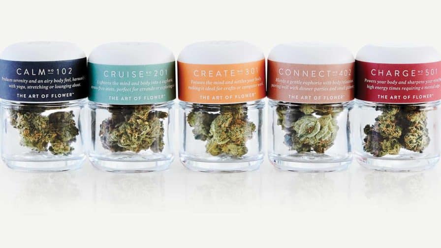
In response to the nebulous and potentially intimidating world of strain names, Canndescent created an effects-based designation system for their products: Calm, Cruise, Create, Connect, and Charge. The single-origin strains are grown in-house and engineered to deliver effects corresponding to their names. Canndescent’s color-coded packaging is refined and streamlined with detailed information regarding tasting notes, the effects associated with each strain, and suggested activities to pair them with.
Monogram
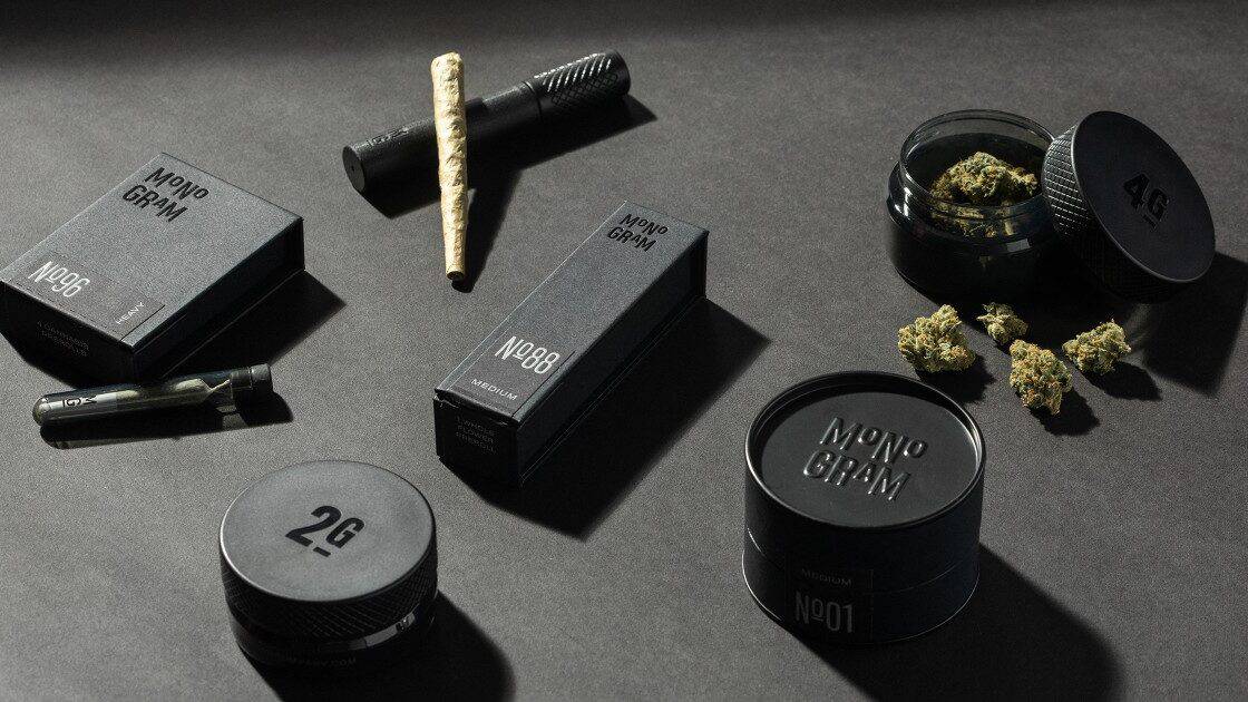
Taking cues from Canndescent’s proprietary strain model, Jay Z’s new line of hand-rolled, house-grown joints “takes inspiration from the smoke experience of a premium cigar.” Numbered strains are divided into three categories: light, medium, and heavy. Monogram’s flagship “OG-Handroll” is housed in a sleek black tube that not only looks bad-ass but functions as a UV blocker. The “Loosie Preroll Pack” comes with four individually wrapped joints, similarly encased in a UV-blocking black box. The brand’s cool, gimmick-free minimalism suggests a product that can effortlessly hold on its own against its flashier peers.
Wyld
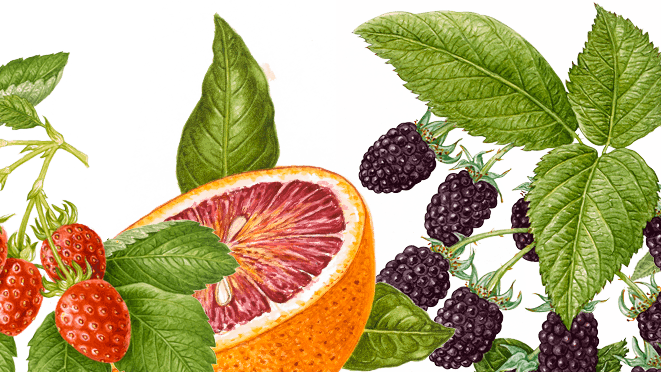
An up-and-coming leader in the realm of edibles, Wyld takes an edgy approach to a classic brand design. Their all-natural gummies and chocolates are packaged in an instantly recognizable geometric box, decorated with classic botanical fruit illustrations and a simple antler logo. The design sparks intrigue with a touch of nostalgia but, more importantly, paints a vivid picture of the Oregon-based company’s connection to nature.
Lowell Herb Co.
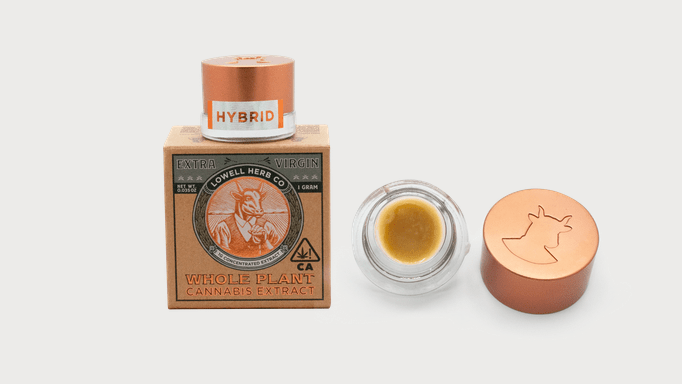
At the heart of the Lowell Herb Co. brand identity is a steadfast commitment to sustainability and social equity. Their 100% organic flower, handrolls, and mints are packaged in recyclable, food-safe containers, featuring a line drawn William “Bull” Lowell logo. The design is a nod to workers wrongfully imprisoned under cannabis prohibition and signals the company’s ongoing contributions to criminal justice reform. By incorporating subtle cues into an attractive, old-timey design, Lowell’s branding invites a more detailed look into their company’s principles without feeling heavy-handed or didactic.
Bloom Farms
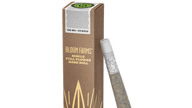
Another brand with accountability at its core, Bloom Farms produces sustainably farmed cannabis products, all centered around the mantra: “relaxation, relief, creativity, and fun.” The crown jewel of their product line: a rosegold “Highlighter” vape pen so pretty it can be worn as jewelry.
The branding is a chic and playful reflection of the company’s eco-friendly philosophy. Biodegradable earth-toned packaging is adorned with embossed metallic lettering, pastel details, and a stylized pot leaf logo. The overall look is the epitome of California cool.
1906
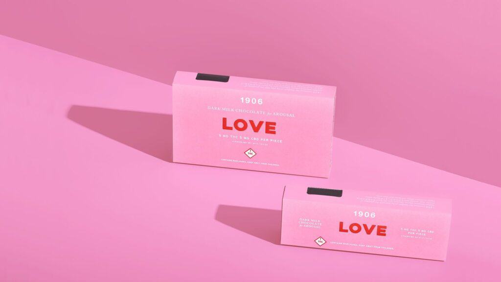
1906 exemplifies a foundational approach to good branding: using simple, punchy imagery to communicate a big idea. Their line of fast-acting, herbal-infused THC:CBD drops are presented in an array of minimalist candy-colored tins. Similar to Canndescent, each formulation is given a one-word title to express the mood they’re meant to enhance (love, bliss, genius, go, chill, and midnight). The brand design is discreet yet striking. With clever, straightforward language at the wheel, fun colors, and a stylish font take care of the rest.
Artet
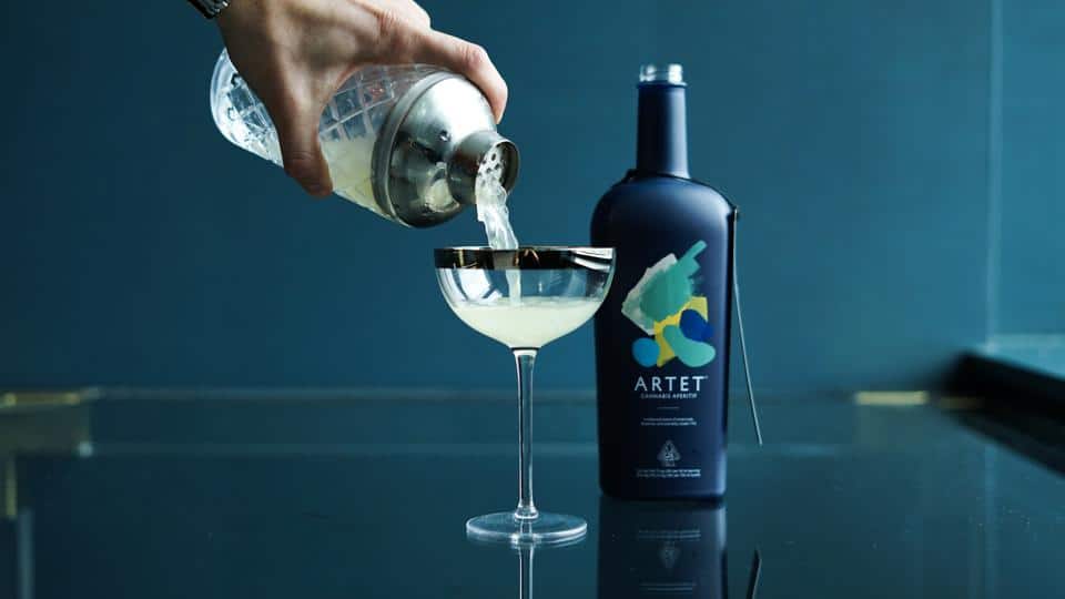
A non-alcoholic, cannabis-infused answer to traditional French and Italian aperitifs, Artet was created with intimate social settings in mind. The beverage is blended with a selection of flavor-enhancing botanicals and comes in a variety of flavors that can be enjoyed on the rocks or mixed into a cocktail. Featuring an abstract design, self-described as “Matisse meets Monet,” the bottles and cans have a classic look that would compliment any mini-bar or fancy table setting.
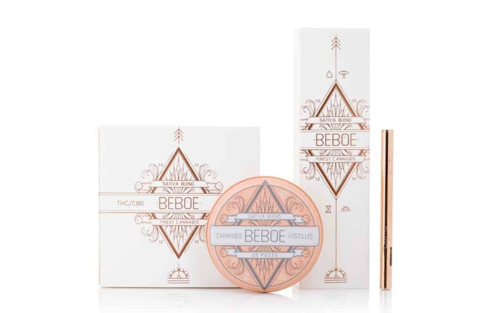
Beboe
Easily the bougiest of the bunch, Beboe’s line of pastilles and glossy single-use vape pens are designed to be “socially dosed,” each with varying ratios of THC, CBD, CBN, and CBDV. The branding seamlessly merges Art Deco, Nouveau, and modern runic design with rosegold embossing for a product that looks ultra-stylish and expensive.
The company expanded into the beauty space in 2019 with a CBD-infused skincare line, Beboe Therapies. Clean, vegan, and paraben-free, the line blends full-spectrum CBD with cold-pressed oils and plant actives to “transition skin to a youthful state of calm and equilibrium.” Beboe’s signature branding aesthetic has been carried over to the skincare line, ensuring that their products receive VIP status on any bathroom counter or vanity.